Such an interesting question. There seem to be so many variables… What’s the focus, the intention, the mood, the patterns and contrasts, the essence we are wanting to catch, what are we trying to convey…. I think often it can be a “gut” thing, like which image has a deeper resonance in us.
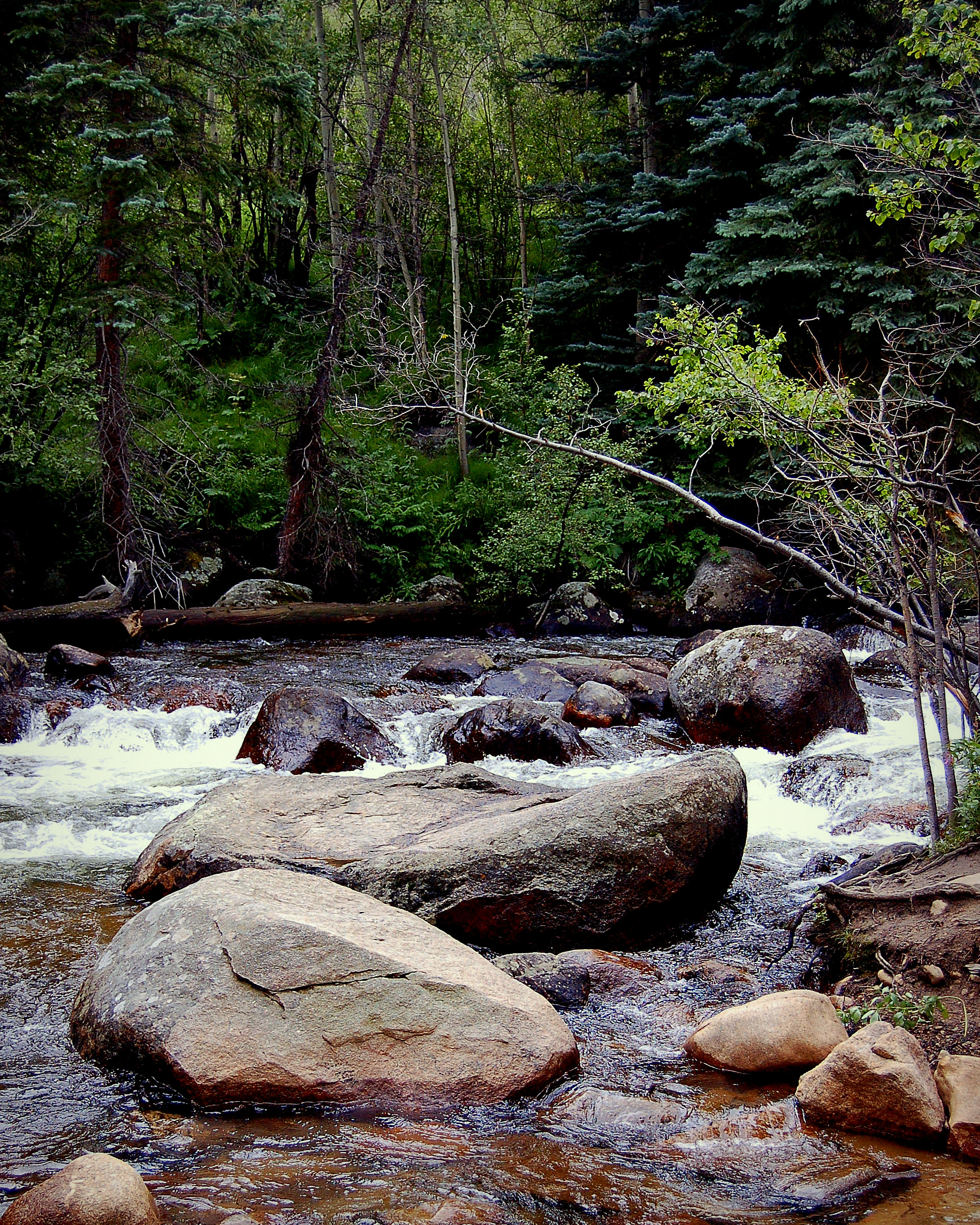
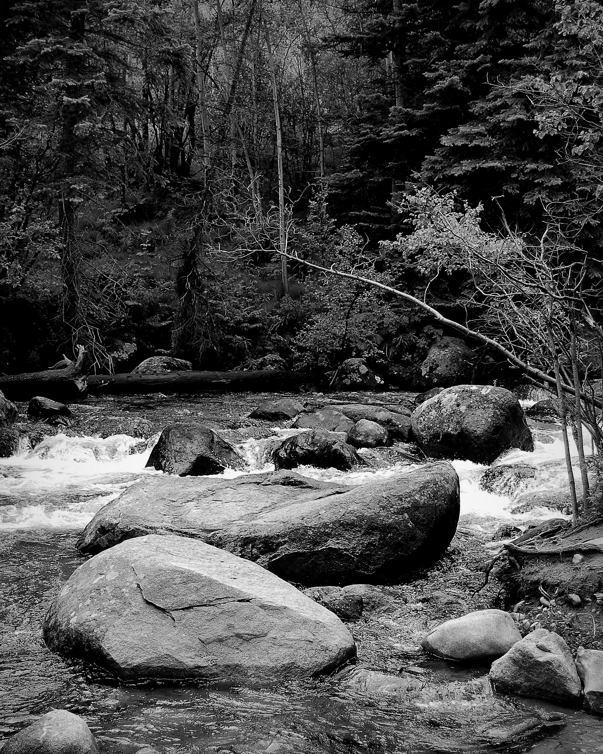
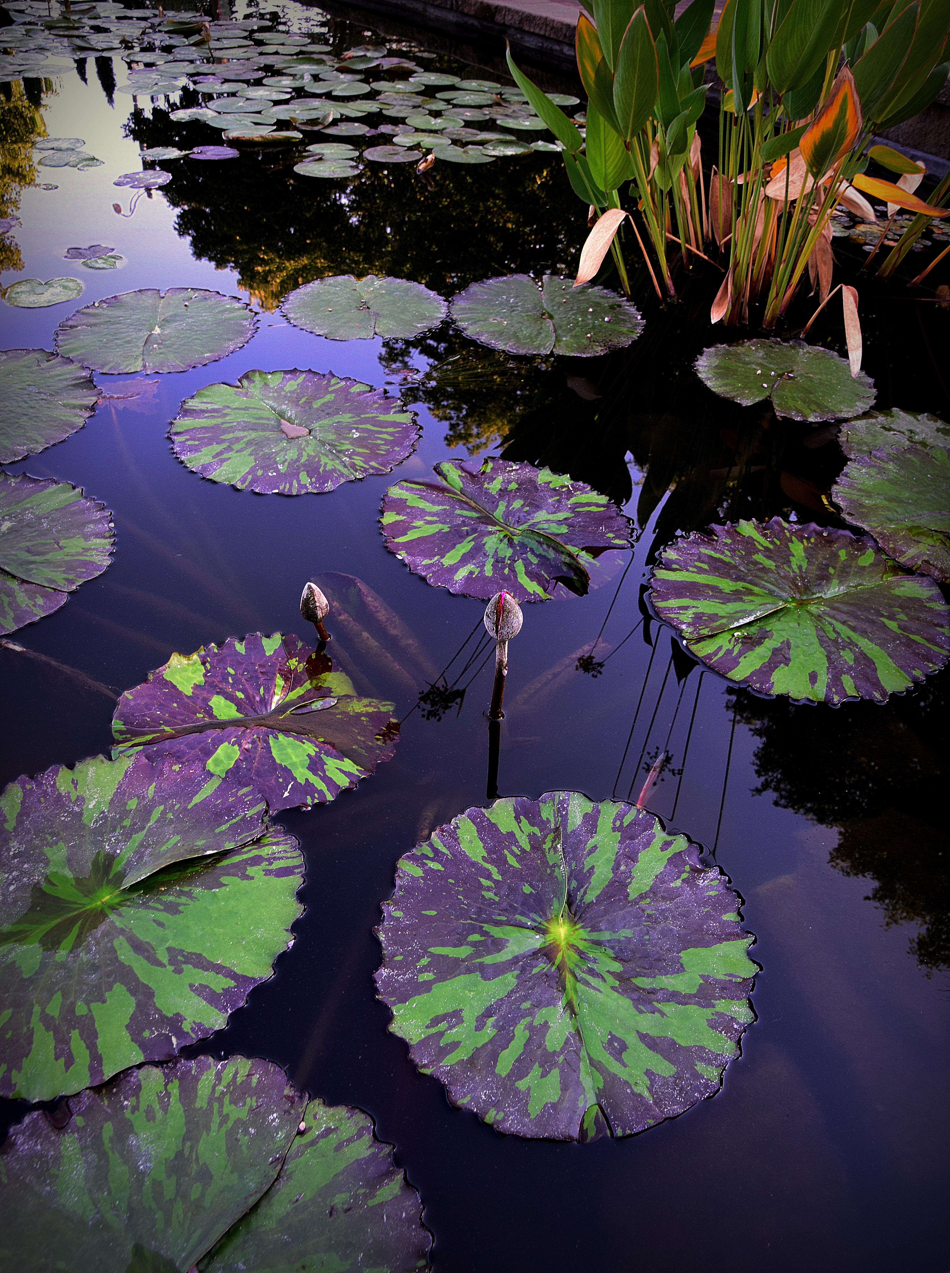
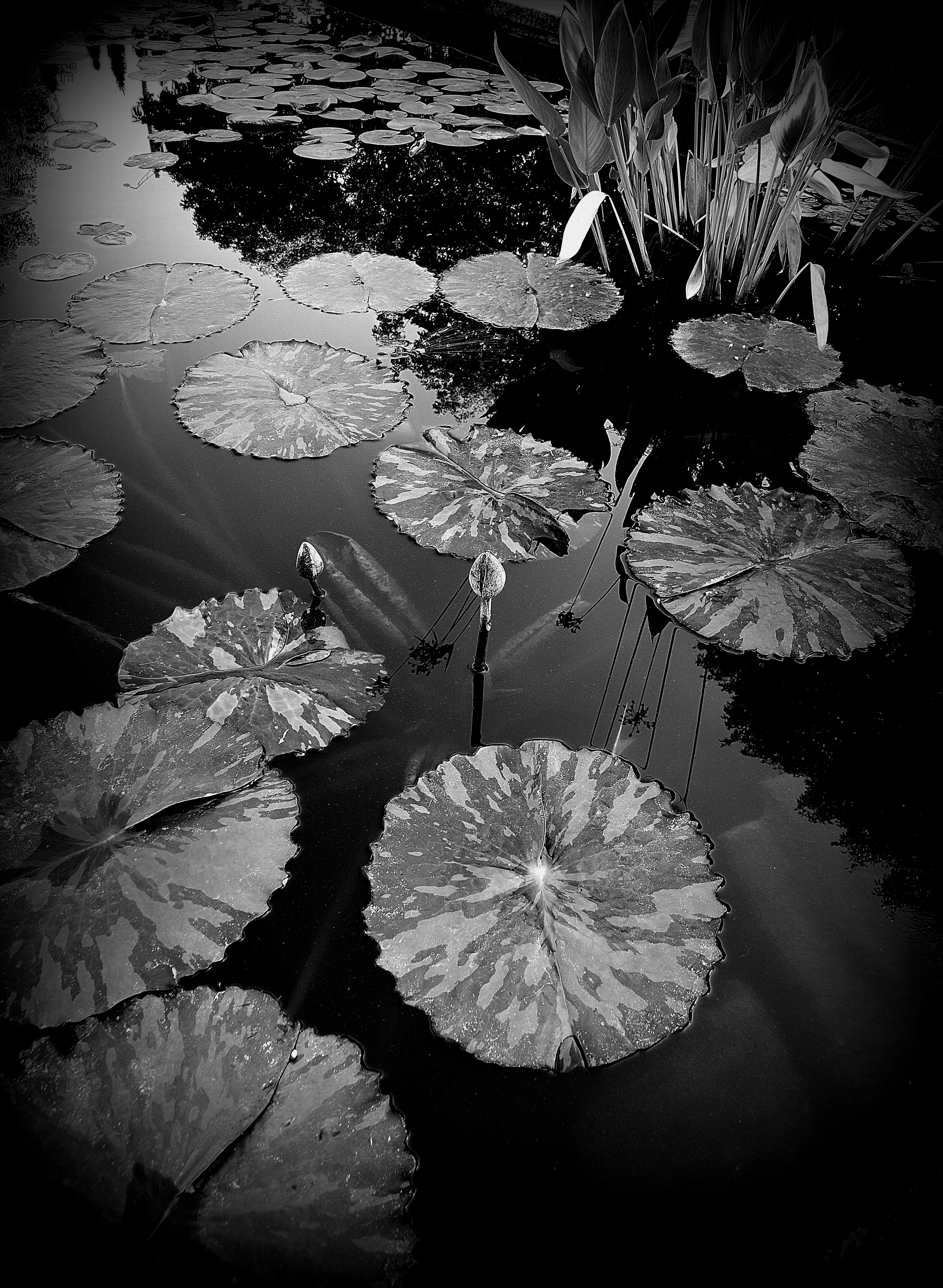
Oh, yes, Sandy, decision, decisions. Your images are so beautiful in both edits that I don’t know if a true favorite exists in each set. The first pair highlights the rocks in black and white. On the other hand, the lush green is so beautiful. For the second, I definitely like the complementary colors. Finally, the third one gives my eyes more light in black and white. Great gallery!
A wonderful set of examples Sandy. I think each of them works well both ways – hard to choose in all of them. Perhaps it would depend on one’s mood while viewing? Either way they are all lovely.
They are all brilliant in both versions. I was curious about your second one as I scrolled down. I love the colours on it but was pleasantly surprised with the monochrome.


❤️❤️❤️
LikeLiked by 1 person
I’m voting for color! 🙂
LikeLiked by 2 people
Such an interesting question. There seem to be so many variables… What’s the focus, the intention, the mood, the patterns and contrasts, the essence we are wanting to catch, what are we trying to convey…. I think often it can be a “gut” thing, like which image has a deeper resonance in us.
LikeLiked by 2 people
Yes, our gut plays a big role, for sure. Thanks for sharing your thoughts!
LikeLiked by 1 person
Totally agree!
LikeLiked by 1 person
Oh, yes, Sandy, decision, decisions. Your images are so beautiful in both edits that I don’t know if a true favorite exists in each set. The first pair highlights the rocks in black and white. On the other hand, the lush green is so beautiful. For the second, I definitely like the complementary colors. Finally, the third one gives my eyes more light in black and white. Great gallery!
LikeLiked by 1 person
Thanks for weighing in, Egidio!
LikeLiked by 1 person
That makes 2 of us.🤠
LikeLiked by 2 people
Hmm, true. Lovely images.
LikeLiked by 1 person
Thanks.
LikeLike
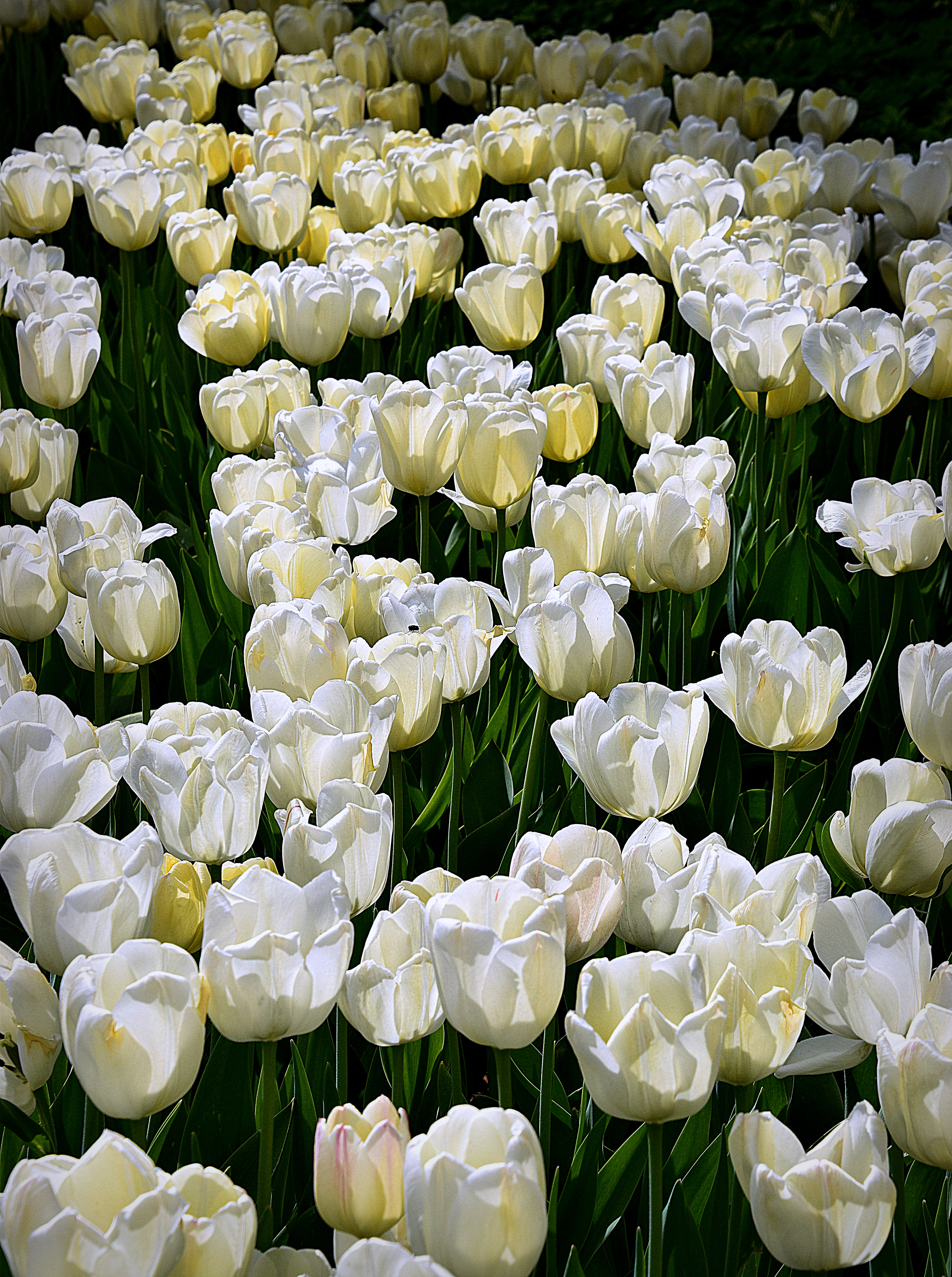
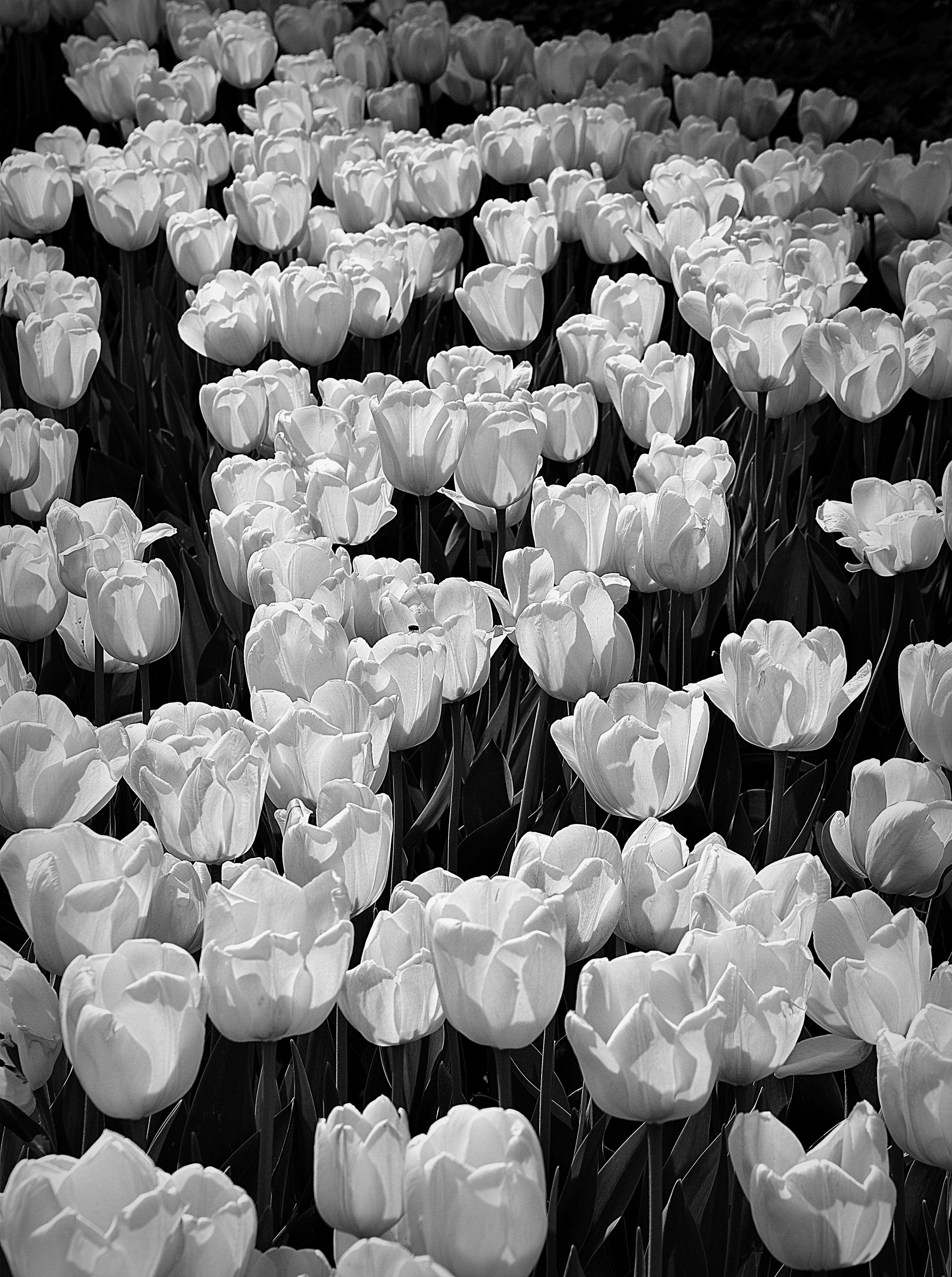
The tulip photo in black & white is particularly striking
LikeLiked by 1 person
Thanks, Sheree.
LikeLiked by 1 person
You’re welcome Sandy
LikeLiked by 1 person
In this set, I would plump for the colour.
LikeLiked by 1 person
Can I cop out and say I like both versions of each.
LikeLiked by 1 person
Certainly. I can’t choose, either!
LikeLike
so beautiful, Thank you, Love, nia
LikeLiked by 1 person
A wonderful set of examples Sandy. I think each of them works well both ways – hard to choose in all of them. Perhaps it would depend on one’s mood while viewing? Either way they are all lovely.
LikeLiked by 2 people
I really like both, also. Thanks for commenting, Tina.
LikeLike
They are all brilliant in both versions. I was curious about your second one as I scrolled down. I love the colours on it but was pleasantly surprised with the monochrome.
LikeLiked by 1 person
It’s difficult for me to choose. I really do like both versions.
LikeLiked by 1 person
Loved both versions of the waterlilies!
LikeLiked by 1 person
Thanks.
LikeLiked by 1 person
It is hard to pick a favorite – I like both versions of the photos!
LikeLiked by 1 person
You are in good company!
LikeLiked by 1 person
Sandy, the tulips are outstanding in B&W, The first two-B&W.
LikeLiked by 1 person
Thanks, Anne.
LikeLiked by 1 person